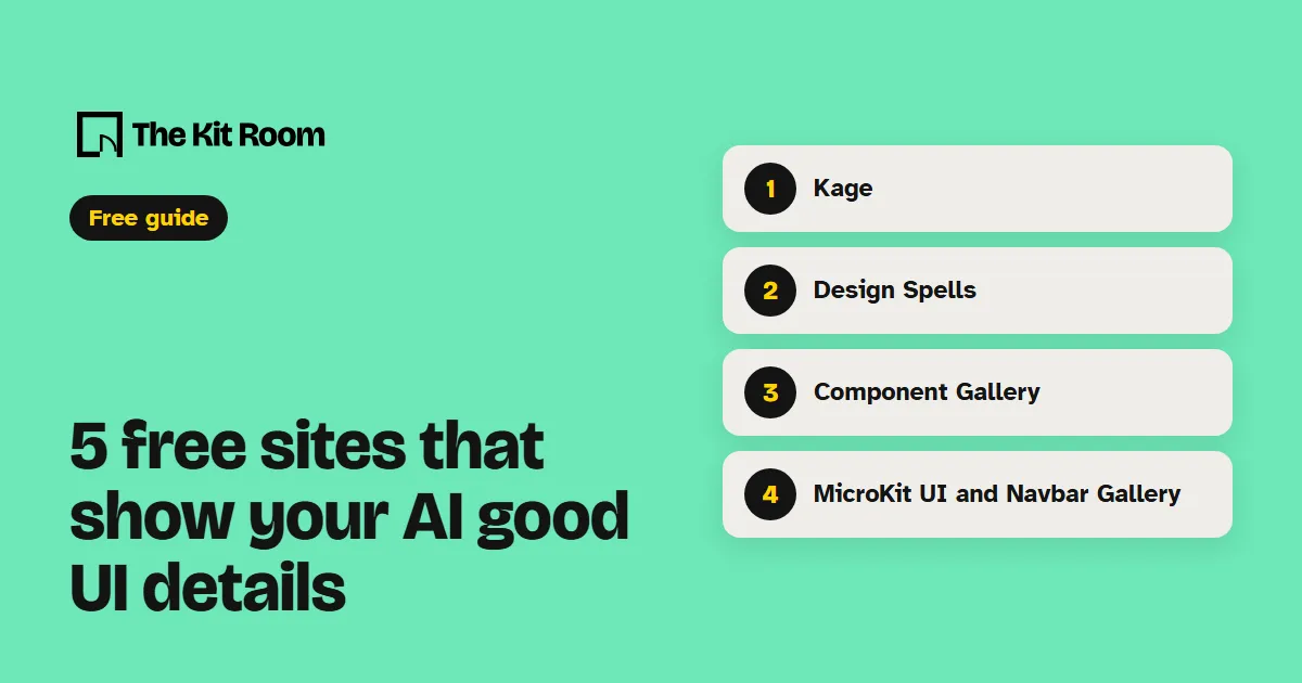
Why show your AI a real example?
Ask for "a nice FAQ" and your AI builds the version it has seen most often. Hand it one real example and it has a shape, a spacing and a behavior to follow. Each site below has a way to get that example into Claude Code or Codex: a link, a screenshot or a ready prompt.
One request works for all five:
Build my [part] like this example: [link]. Copy the layout and how it behaves. Keep my own words, colors and fonts.Step 1: Kage
Kage collects interfaces from real products and sorts them by part, like heroes, feature grids, pricing tables and footers, and by style. Open a design and press Copy as prompt. The prompt describes the page in words your AI can build from.
Here is a design prompt from Kage: [paste]. Rebuild my pricing section in this style with my own three plans and prices.Step 2: Design Spells
Design Spells collects short videos of micro-interactions and easter eggs from real apps. Filter by Interaction, Animation or 404 to find the kind of detail you want.
Your AI can't watch the video, so say what moves, or paste two screenshots: one before and one after.
When someone hovers my logo, make it do a small playful move like the one in these two screenshots. Keep it under 300 ms and turn it off for people who choose reduced motion.Step 3: Component Gallery
The Component Gallery has 2,671 examples of 60 components from 95 design systems. Each component page shows how different teams build the same part, with links to their code and usage notes.
Read component.gallery/components/accordion and two of the design system examples it links to. Then rebuild my FAQ as an accordion that works with the keyboard.Step 4: MicroKit UI
MicroKit UI has 54 micro-interactions you copy into your site: buttons that glow or hold to confirm, checklists that tick off, and more. They come in React or CSS under the MIT license. In a React project with shadcn, each one installs with a single command, like this one:
npx shadcn@latest add @microkit/cursor-edge-glow-buttonLook at the micro-interactions on microkit.co and pick one for my main signup button. Install it and match it to my brand color.Step 5: Navbar Gallery
Navbar Gallery shows only navigation bars from real sites, sorted into types like dropdowns, mega menus, side bars and search bars. Pick the type your site needs and screenshot one you like.
Here is a screenshot of a menu I like. Rebuild my top menu in this layout with my own pages, and make it open as a full-screen menu on phones.What should you watch out for?
Take the layout and the behavior from these examples, and keep your own words, images, logo and colors. Another brand's text and pictures stay theirs.
Some of these sites show sponsored tiles. Everything on this page is the free part.
Ask for one change at a time and check the page on your phone before the next one.